
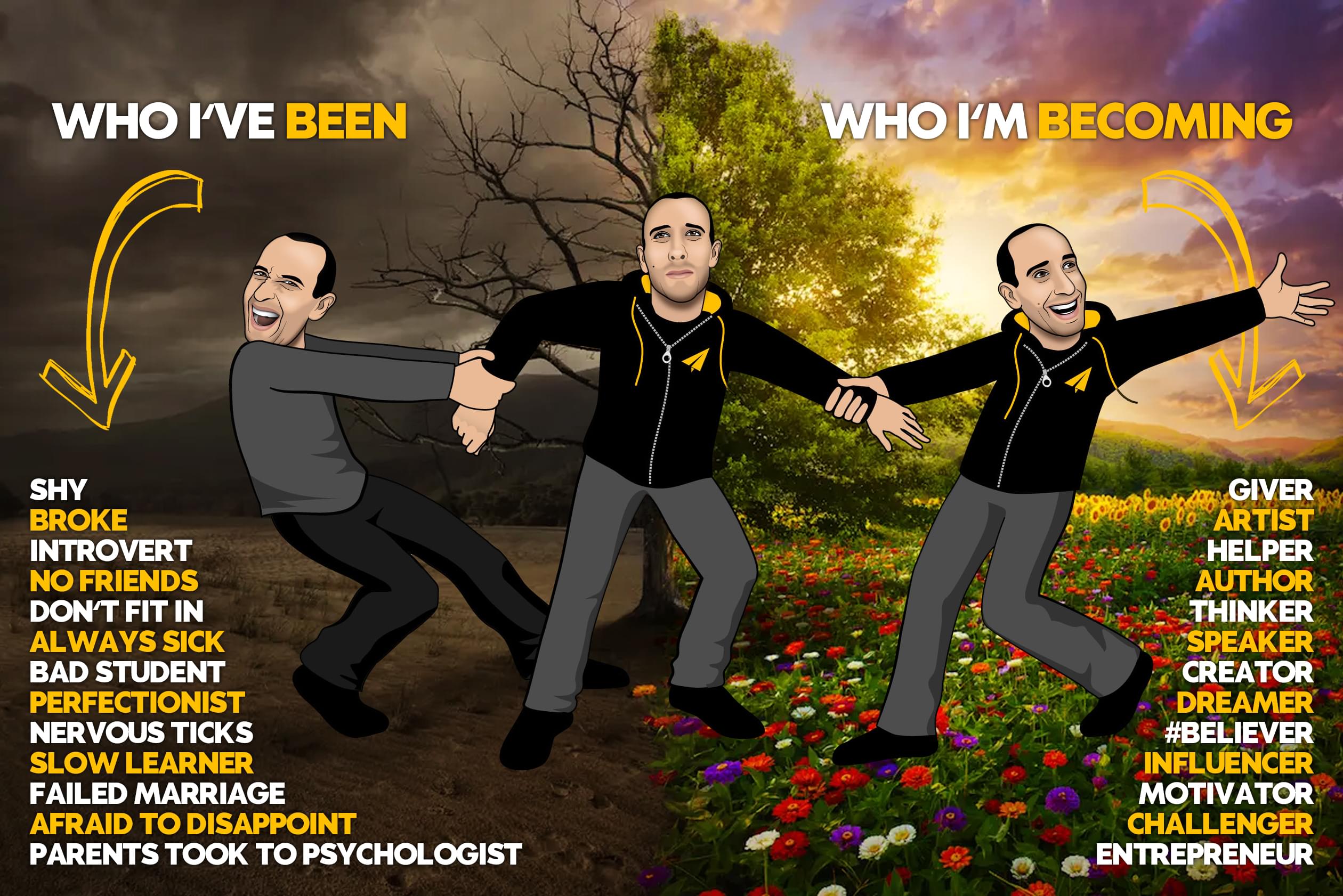
it's not your fault.
at 8, I went to see a child psychologist.
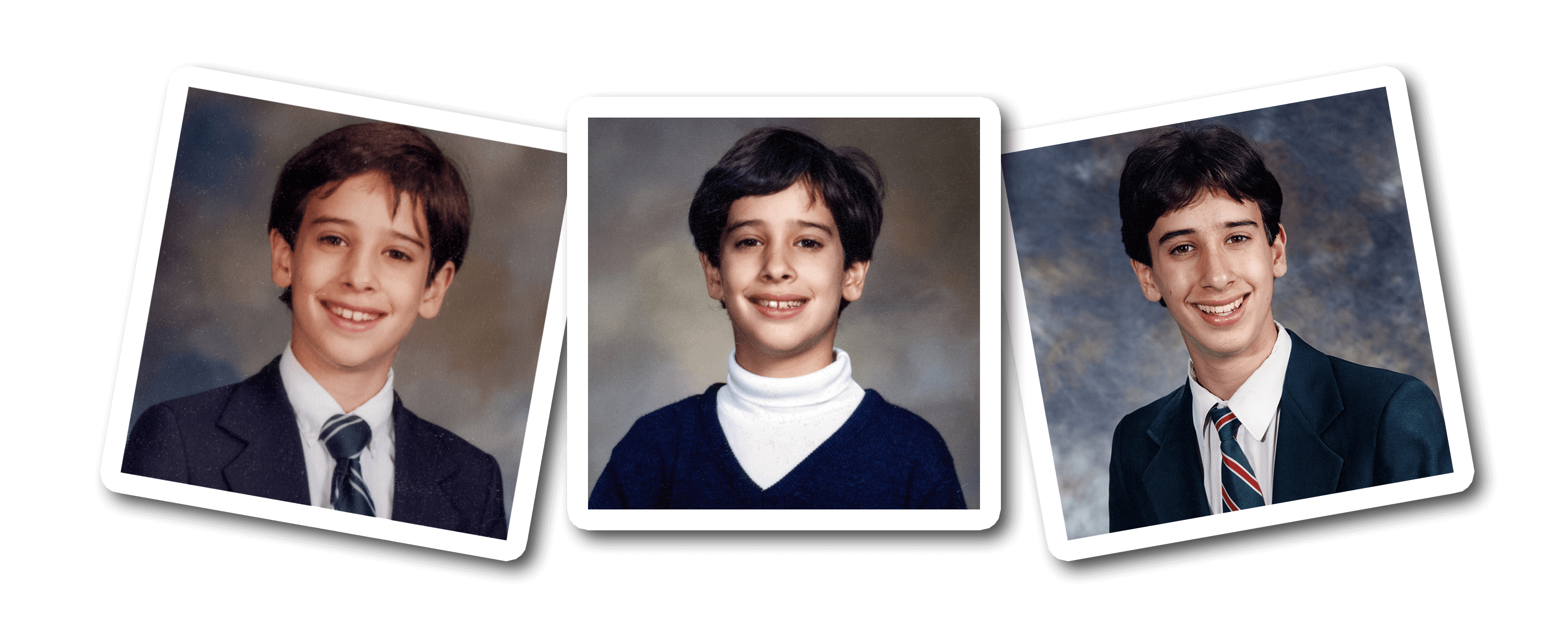
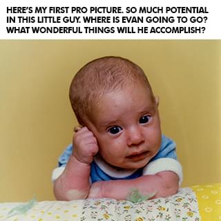
I always seemed to be a slow learner. It took me 19 months to learn to walk and people kept asking my parents what was wrong with me. When I went to school at 3, I spent a lot of time sitting under my desk instead of participating in class. I was sick all the time, constantly on antibiotics for terrible ear infections, and in and out of surgeries to try to fix my hearing problem. I jumped between three different schools and my parents were worried that I wasn't getting the extra attention I needed, and that I also wasn't making any friends.
My mom said she began to notice some serious changes in me as I went from being a happy child, adventurous and curious, to becoming more withdrawn and developing nervous ticks. So they took me to a child psychologist who suggested that I change schools and go to an all-boys one until I finished high school. I never did well in school, never really had many friends, and my teachers always accused me of just doing the bare minimum and not trying.
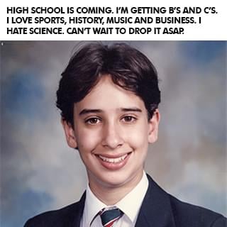
But my parents always told me, "You are Evan Castrilli Carmichael and you can do anything you believe you can." And in my final year I was assigned Mrs. Farr as my teacher-mentor. Most kids rarely met with their teacher-mentors but I met Mrs. Farr every week and she helped me believe in myself too. In that last year of high school I went from getting B's and C's to getting an A+ in every class and landed a full scholarship to the university of my choice. I wasn't stupid! I just needed a little extra help.
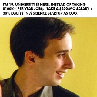
at 19, i made the hardest decision of my life.
When I graduated high school I thought I had it all figured out. Go to university, study economics, and become an investment banker. But when I got to university, I got the opportunity to join two entrepreneurs who had started a software company and they offered me a 30% stake in the business to join them. The more I worked on my new business, the more I realized that nothing I was learning in my university economics classes was helping me. I thought university was going to be the answer to everything but quickly saw that, unless I wanted to become an economist, everything I was learning for four years was pretty much useless to me in practical real life.
So at 19 I had to make the hardest decision of my life: Stay with the company I owned where I was only making $300 per month or take the six-figure investment banking job I dreamed of. I struggled a lot with the decision. What if I'm not good enough to be an entrepreneur? What if I don't make it? What if I can never support myself? What if I blow my one chance to make it as an investment banker? Can I really turn down six figures when I'm only making $300 per month? What will people say if I turn this job of a lifetime down?
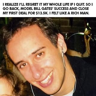
In university, some of my friends were taking a year off to travel and explore before getting a job, so I decided that I'd take a year off and invest in myself instead by trying to make my business work. I was inspired by Amazon founder Jeff Bezos, who left his high-paying investment banking job to become an entrepreneur because he didn't want to live with the regret of not knowing. So I decided that I didn't want to have regrets when I was older and that I would rather know and fail than not know. I turned down the job and went to work full time on my business. You don't know until you actually try, so I went for it, and then almost instantly regretted it.
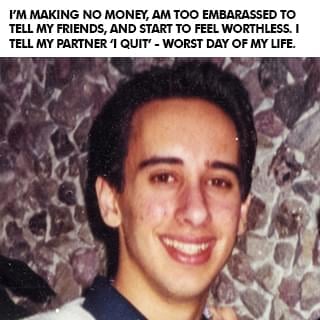
I felt like a giant loser who made the biggest mistake of my life.
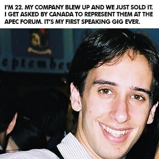
At 22, I lost a $40 million deal.
I'm an introvert whose biggest fear is letting people down.
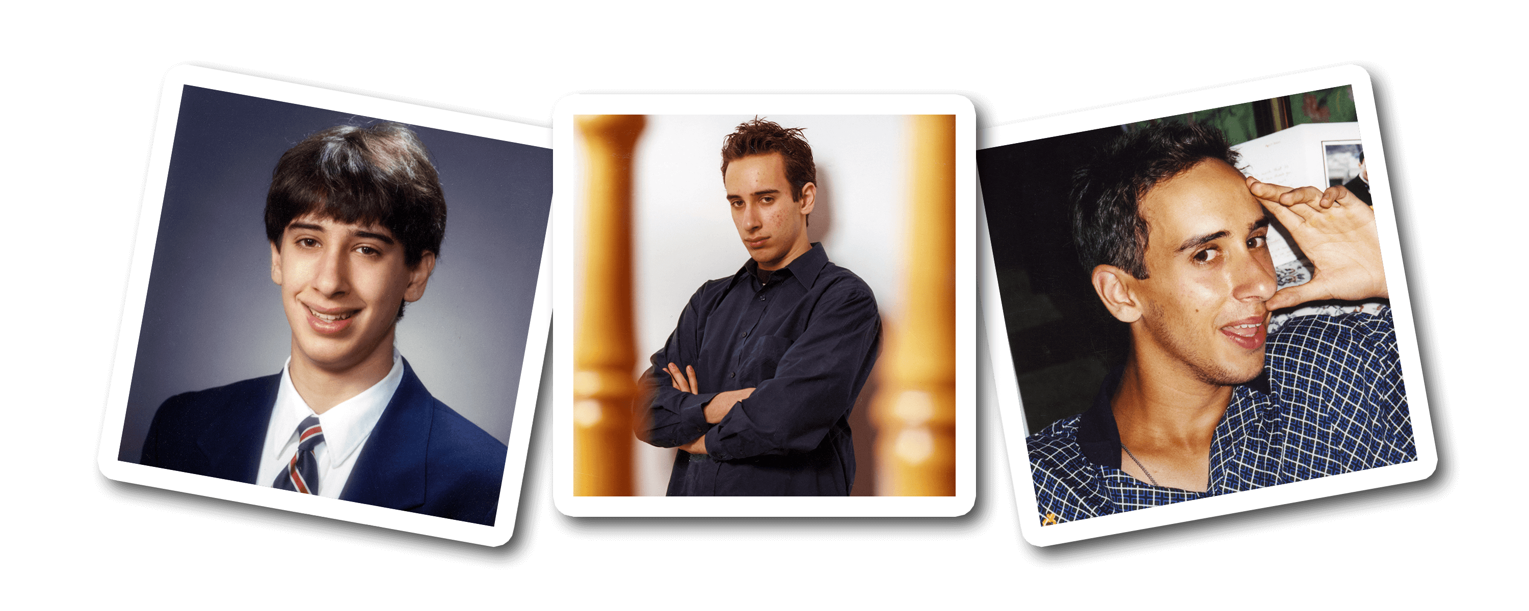
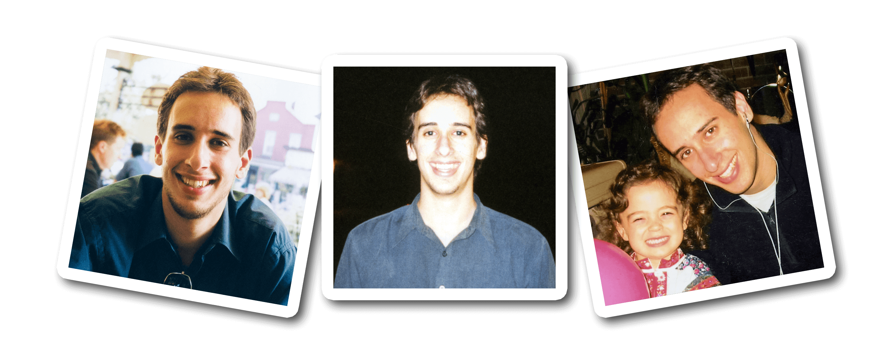
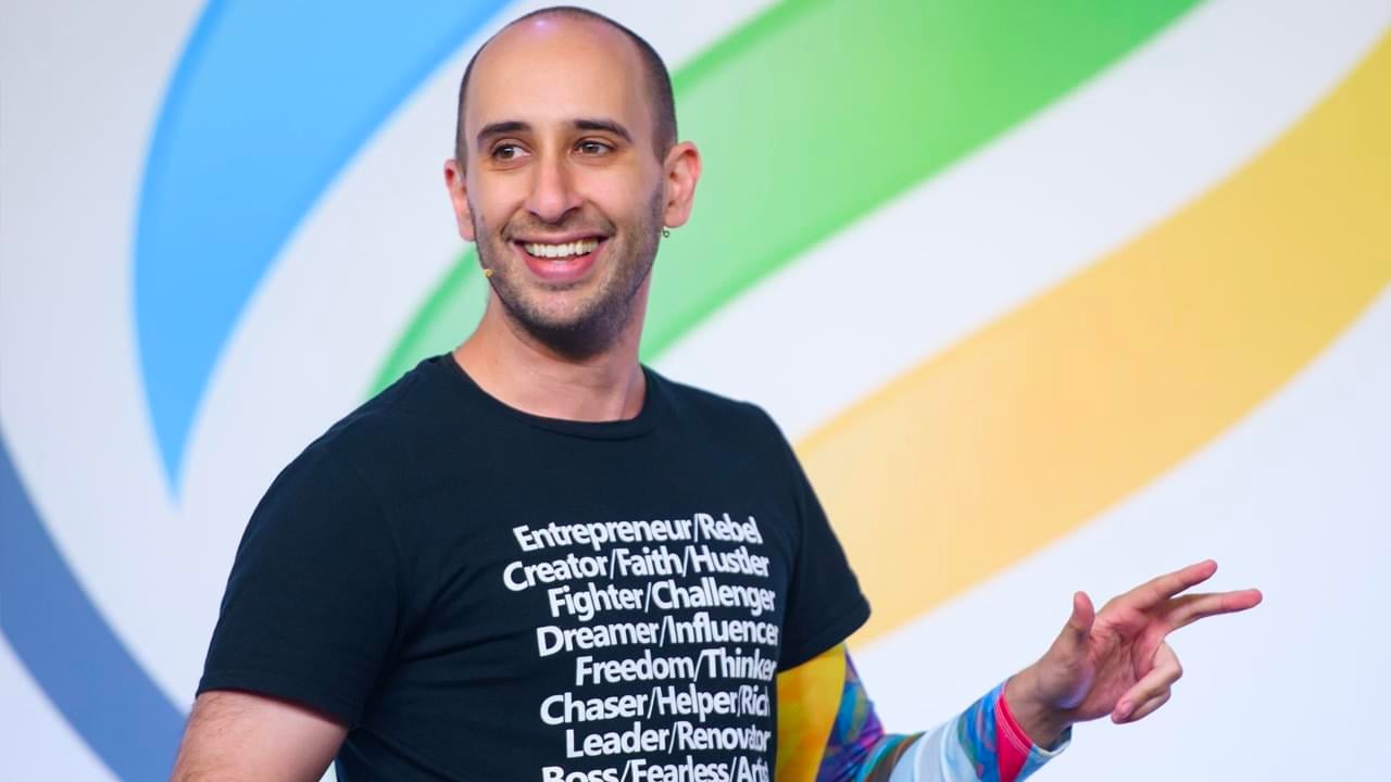
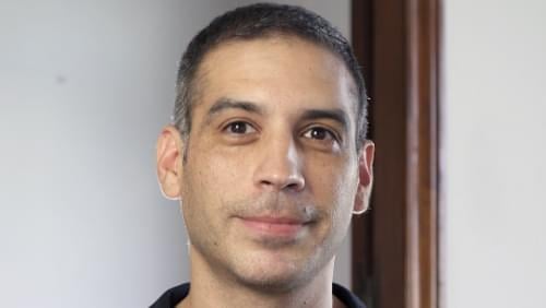
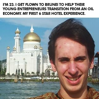
(The picture is of me above is when I was 25 and thought the only way to be taken seriously was to wear a suit. LOL)
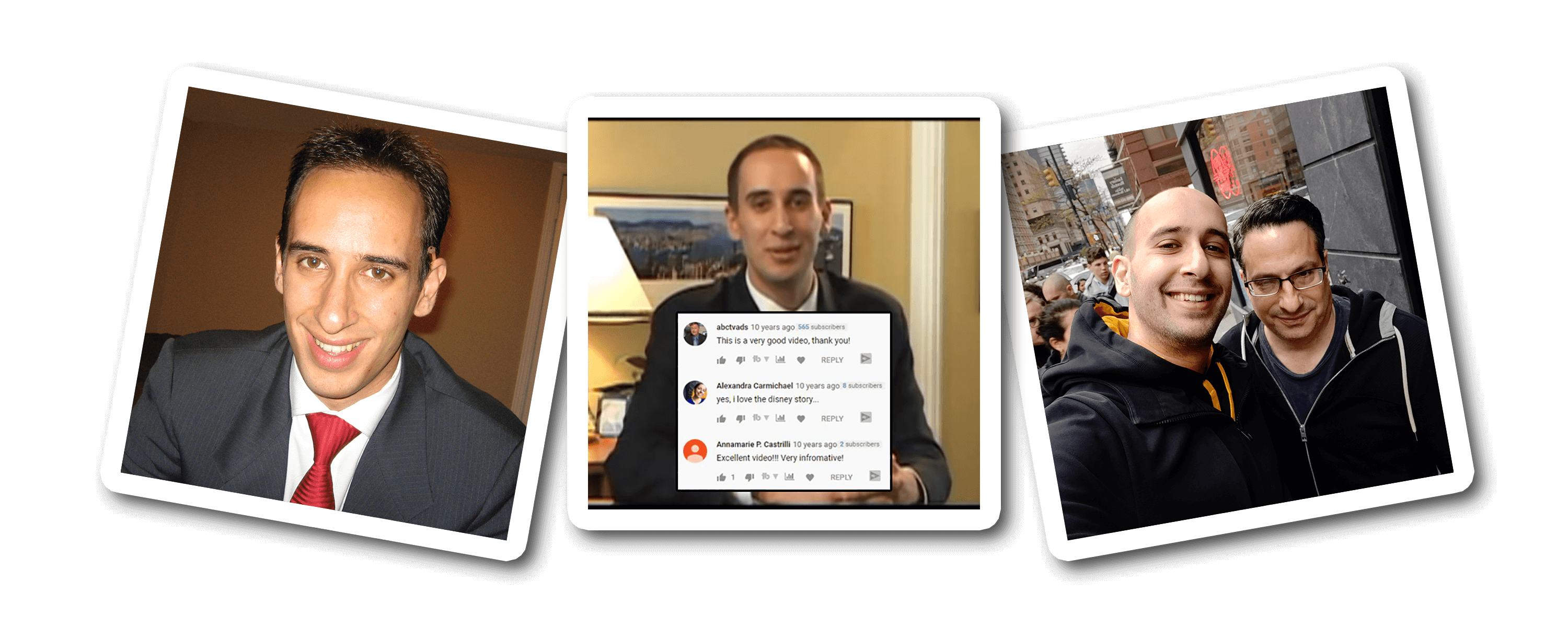
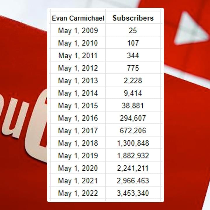
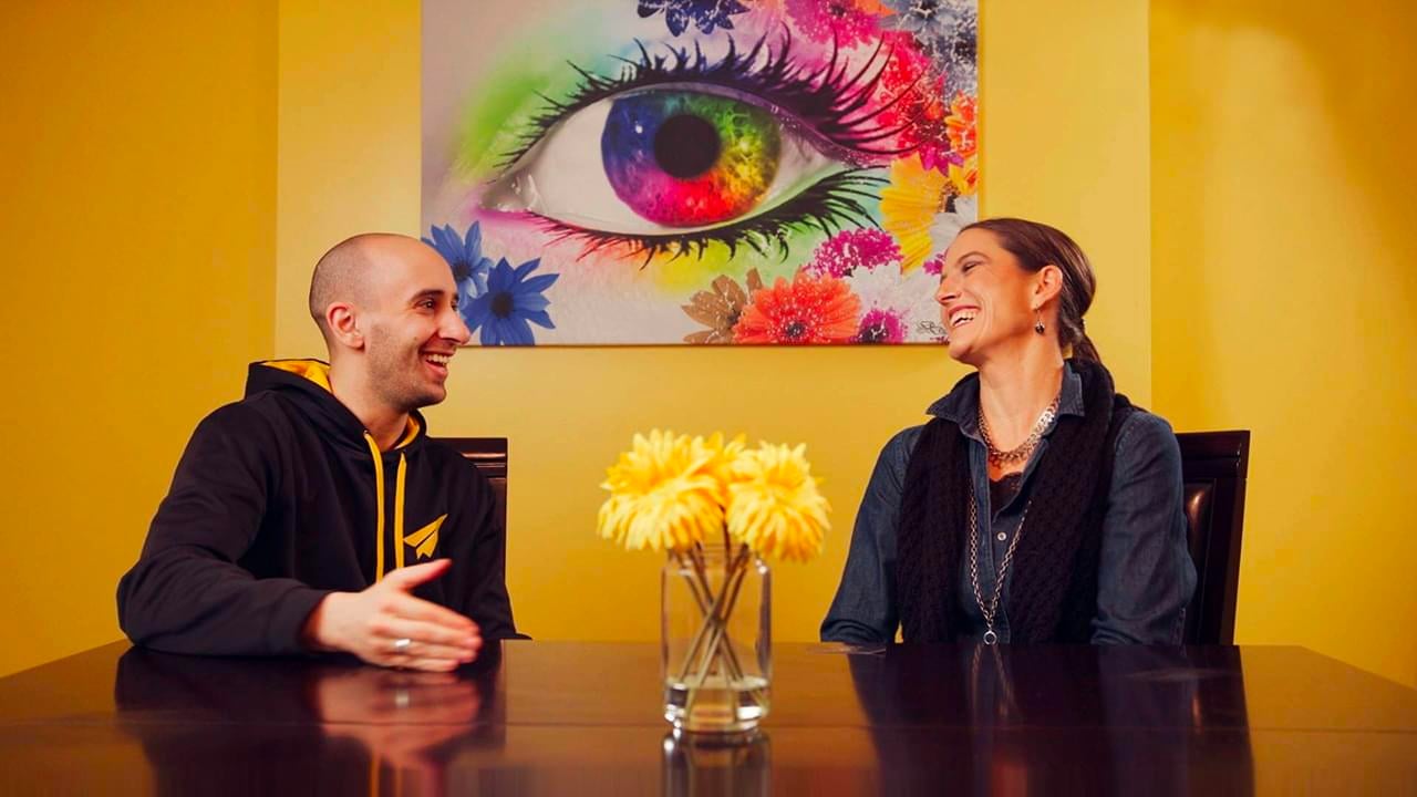
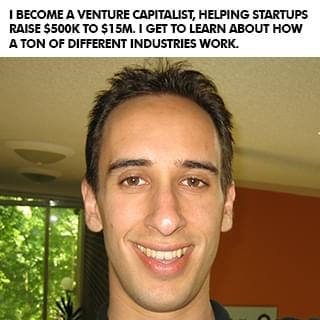
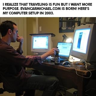
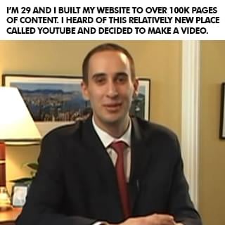
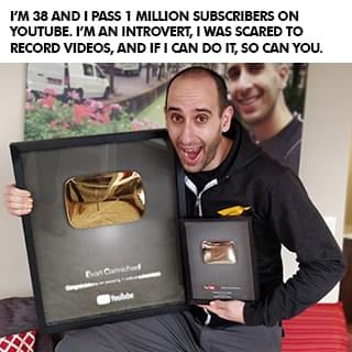
After I sold my business I did a bunch of speaking gigs around the world, started another software company that did not succeed, became a venture capitalist raising $500,000 to $15 million for businesses, started a popular website off of my name with over 100,000 pages of content . . . and then eventually started a YouTube channel in April of 2009. I'm a visual learner so I would much rather see something than read it or hear it. Looking back on my early struggles in school, that's probably at least partly why I didn't do well. So when I heard about YouTube, I decided this would be a cool place for me to share some visual content to help other entrepreneurs! But I was shy, nervous, afraid, and felt like an introvert couldn't win on YouTube. I was scared that I would let people down.
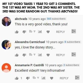
In one full year of my first video being up, only three people left a comment: my mom, my older sister, and some random guy who found my video. Three comments in one year. See, I'm an introvert. I didn't go on YouTube to be famous. I did it to try to help. But it took me a long time to get comfortable in front of the camera. I never felt like my story was good enough or that people wanted to hear from me. I couldn't film with anyone else in the room, even if it was my sister. I was nervous, shy, and disappointed with everything I made. But I still created because I had learned my $40 million dollar lesson of being a perfectionist. I created, but I was still scared of letting myself and my small audience down.
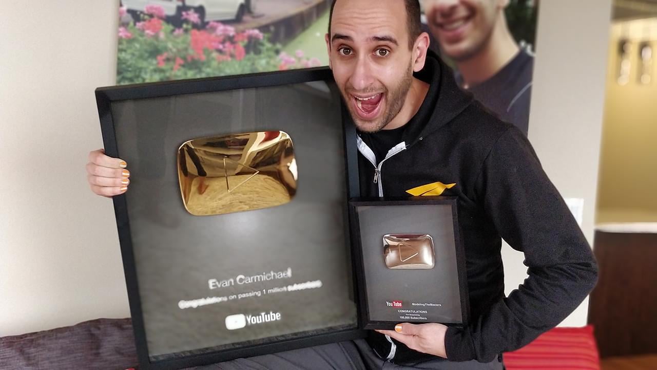
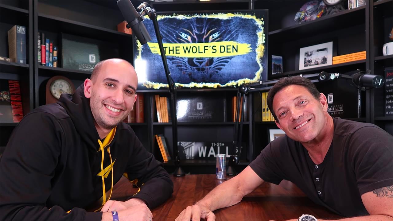
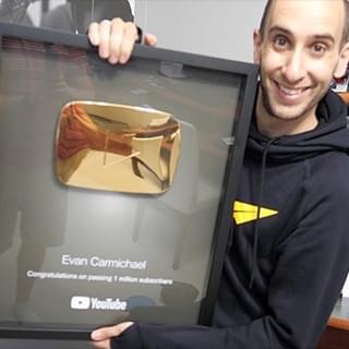
And then I met my now-business manager, Steve. He's a hardcore New York guy who helped build people like Mel Robbins and Grant Cardone into brands. He told me my problem was that I didn't want to get famous, and he hadn't met anyone as nice as me, so he'd take a chance on me. It wasn't easy but Steve punched, kicked, and hugged me through the now 10,000+ videos that I've now made and he helped me get better. In the first 6 years without him I went from 0 to 9,000 subscribers. Over the next 6 years with him I went from 9,000 to over 2 million subscribers. Again, without the mentor or model, I failed. With them, I succeeded.
I'm still an introvert. My biggest fear is still disappointing people. I still feel not good enough for the next level in my life, still have nervous ticks that show up every day, and still don't fit in to most social groups. But I've learned to tell myself that, "I do difficult things." I've learned to not allow those fears and struggles to prevent me from taking action. And I've learned to adapt my learning style so I learn through visuals instead of telling myself I'm stupid because I can't learn other ways.
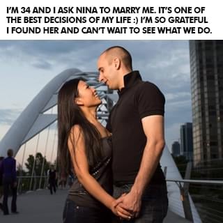
(Having a supportive spouse helps a ton too!)
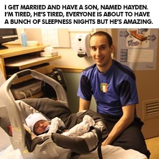
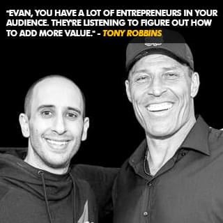
And I've got other insecurities like being divorced, having a son in another part of the country, and worrying that I'm not a good enough father. I still get nervous before I get on stage, still doubt myself before I get on camera, and still get insecure before I do an interview. I struggle with these things but I don't let them stop me. Whether it was people I could talk with like my parents, Mrs. Farr, or Steve... or people I could model like Jeff Bezos and Bill Gates, I learned that even if everybody around you is negative, hopeless, and toxic, if you can get just one person who makes you believe that something greater is possible, it can make all the difference in the world.
I've had the tremendous honor of helping millions of people around the world and if any of this resonates with you, I'd love the opportunity to humbly be one of your guides. Like I said at the start, it's not your fault where you're at right now. You did the best at the time with what you had. But where you are now doesn't have to be where you end up if you get the right people and models to follow. I #Believe in you.
Evan Carmichael bio
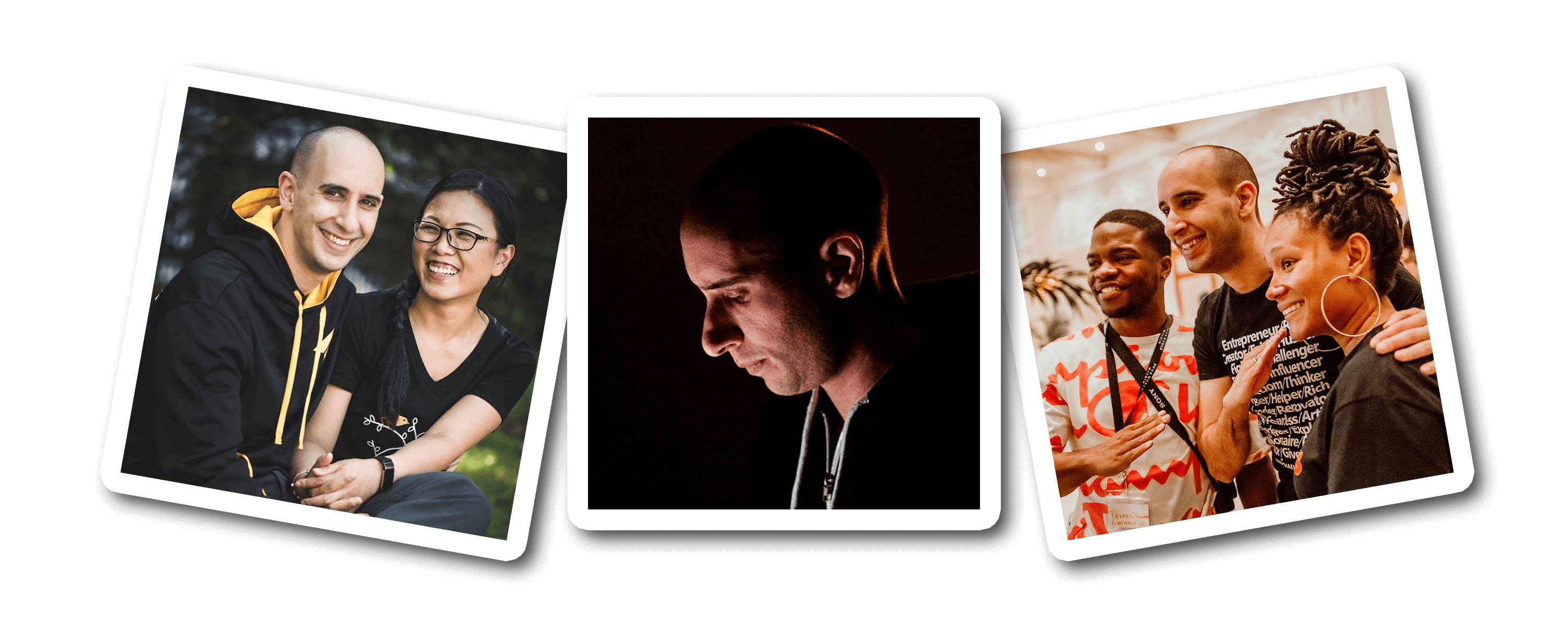
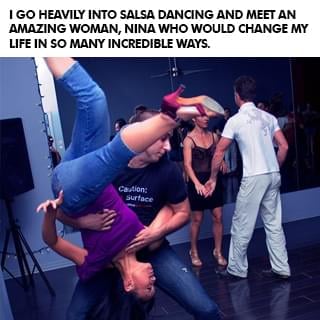
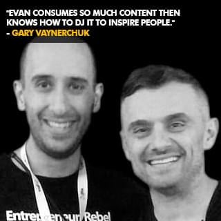
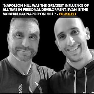
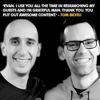
Evan Carmichael #Believes in entrepreneurs. Gary Vaynerchuck called him the DJ who inspires people and Ed Mylett called him the modern day Napoleon Hill. At 19, he built then sold a biotech software company. At 22, he was a venture capitalist raising $500k to $15M. He now runs a YouTube channel for entrepreneurs with over 3 million subscribers and 500 million views, wrote 4 books, and speaks globally. He wants to solve the world's biggest problem, people don't #Believe in themselves enough. Forbes named him one of the world's top 40 social marketing talents and Inc. named him one of the 100 great leadership speakers and 25 social media keynote speakers you need to know. He's set 2 world records, uses a trampoline & stand-up desk, owns Canada's largest salsa dance studio where he met his wife and has a giant Doritos bag in front of him all day long to remind him that he's stronger than the Doritos. Toronto is his home. He's a husband, father, League of Legends Fan and Teemo main.
LEARN WHY I DO WHAT I DO!
Click the button below to meet the man behind the channel, hear my story, and even grab a few bonus gifts.
good karma projects
So how do you solve the world's biggest problem? I don't have all the answers but it starts with taking bold bets that have the potential to impact a billion people. Here are some of the good karma projects I'm working on that I hope puts a #Believe dent in the universe. Click the button below to learn more about Good Karma Projects.
YouTube Channels
I've been on YouTube since April 2009. There are thousands of videos on these channels for you to learn from, 100% free:
Q&A With Evan
I go live multiple times per week doing Q&A's and free coaching. Click the button above to see the live calendar schedule.
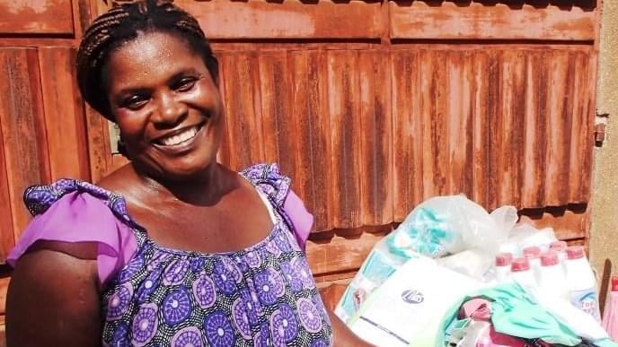
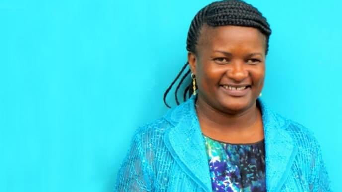
microlending
I've loaned money to over 7,000 entrepreneurs through Kiva. This is Aminatou from Togo. She sells clothing to support her 5 kids.
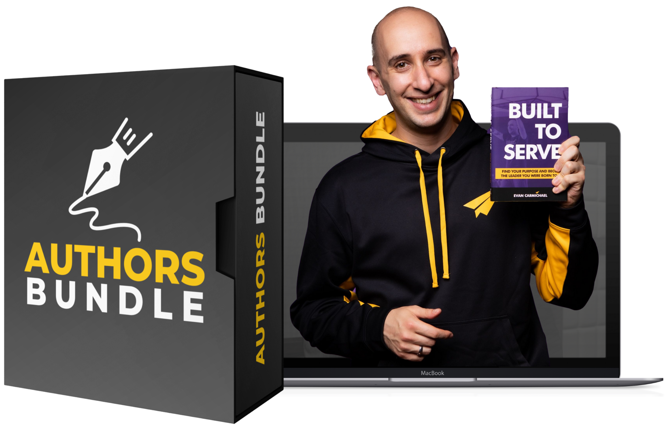
Free Training
What makes the difference between where you are now and where you want to go? The belief that it's possible and the knowledge to make it happen. These free programs will give you the inspiration and strategies that you need to succeed! It's what I wished I had when I was getting started to help me level up, and now you get them, 100% free!


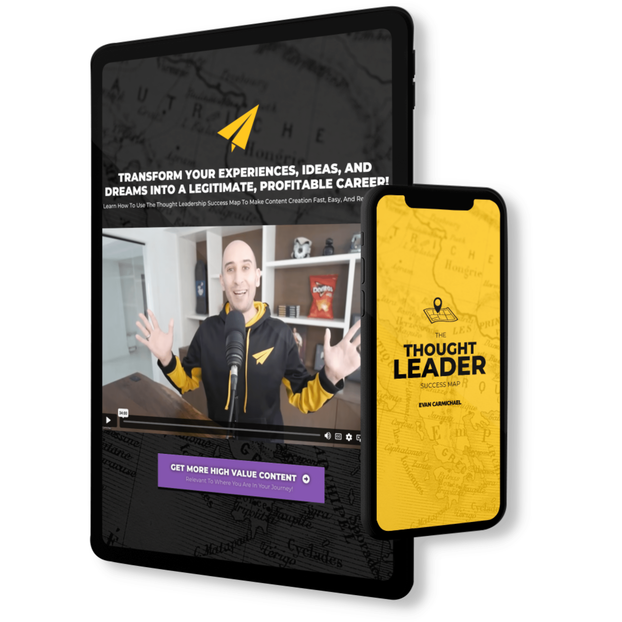
Discover How To Transform Your Experiences, Ideas, And Dreams
Into A Legitimate, Profitable Career!
- Streamline Your Content Creation Process To Grow On Every Platform Without Becoming A Full-Time Influencer!
-
Use A Simple, Repeatable Process That Allows You To Get Your Message Out In Front Of The Most People!
-
Build A Large Online Following Without Having To Deal With Overly Complicated Tech And Generic Growth Strategies!
-
Generate High-Ticket Sales And Build A Successful Thought Leader Business!
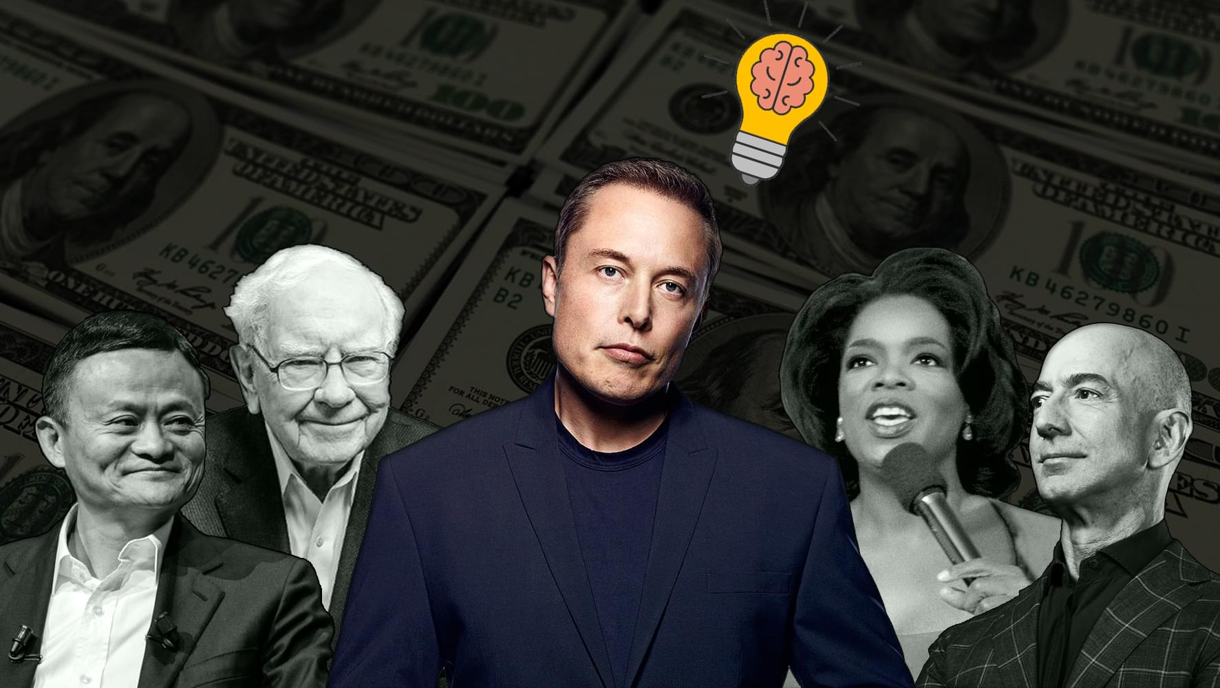
Billionaire Mindset
Learn the success habits, mindsets, and routines that billionaires incorporate into their daily lives that you can too!
change your life
You can change your life in 30 days. #BestLife30 is a free 30 day video series specifically designed to help you jump into your best life!
Create new habits
It takes up to 254 days to build a new habit. These free videos will help you shift your mindset and take charge of your life!
Level up with Evan
If you love all the free stuff I put out and find value in it, here are a few ways to take your experience up to the next level with me. Disclaimer: I was the guy who was making $300 / month in my first business so I know how much every dollar means and I try to jam my programs with as much value as possible. I always recommend that you start with the free materials and prove that what I do helps you first. Then, if that resonates with you and you're getting value, consider some of these programs below. It would be my honor to guide you in leveling up your journey.
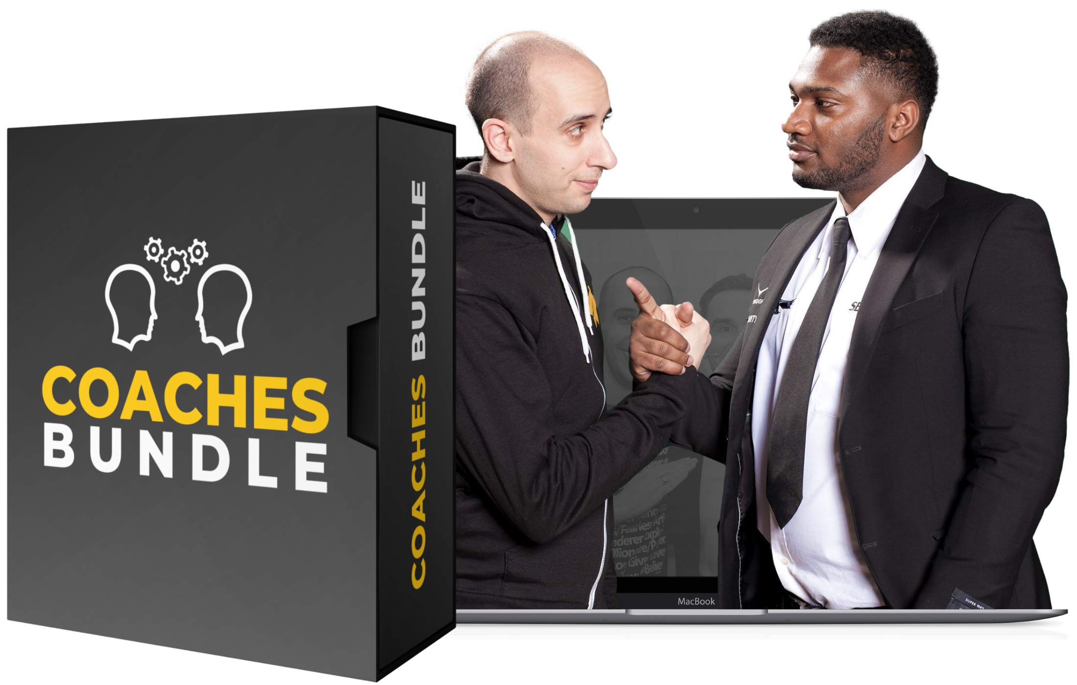
MASTERMIND
Unlock Extraordinary Success: Apply For The Incredible In-Person Mastermind For High-Achieving Thought Leaders.

brandlytics
Train with Evan to get the expert tactics you need to grow your YouTube channel!
movement makers
Train with Evan live twice a month to become a thought leader & monetize your brand!
Evan 1 on 1
Pull up a chair and let's chat. Whether you want to get free help by coming on with me when I go live on Instagram, want a private coaching session, or want to interview me for your show or podcast, I'm looking forward to spending some 1 on 1 time together and injecting some more #Believe into the planet.
Q&A WITH EVAN
I go live multiple times per week doing Q&A's and free coaching. Click the button above to see the live calendar schedule.
private coaching
I don't do a lot of private coaching but if you're willing to buy and donate some books, I have two spots open every week.
interview me
Do you have a podcast or show and want me to come on? My calendar fills ups quickly but I do make time every week for interviews.
Hire Me to Speak
If you've got an event with leaders who want to serve the world then I want to help. I'm going to inspire them and give them the tactics and momentum that they need to grow. My goal is for your event to be the turning point in their lives that propel them forwards into greater success. This event has to count. My time on stage will make the difference.
Interactive chats
This is my favorite thing to do. Set up context and then answer questions directly from the audience to bring the most value.
keynote speech
Want to bring some #Believe to your next event? Have me open or close and give your audience an experience to remember.
Hire Me
Please contact my agent Steve in New York to figure out scheduling, budget, and topics. I'm excited to speak to your group!
Entrepreneurs I've invested in
Most of the work I do is at scale. I want to reach a billion people so that leads me to create YouTube videos, books, and do events where my message can touch a lot of lives. But I also love collecting good people and every now and then I run into special humans and end up investing in them because I #Believe in what they're doing and the impact that they want to have. Here are a few of those special humans I've invested into:
Aleks Saiyan
Aleks went from being a security guard to running Toronto Dance Salsa, Canada's (maybe the world's) largest salsa dancing school.
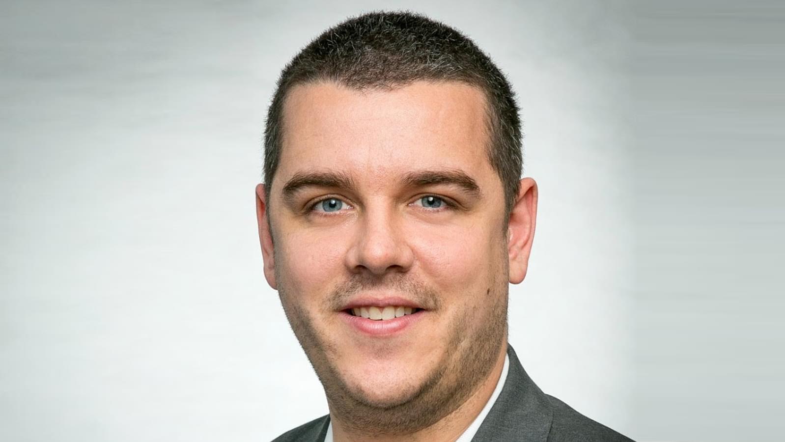
Jeremy Stickney
Jeremy went from being a grocery store clerk to running a six-figure YouTube consulting agency helping thought leaders grow.
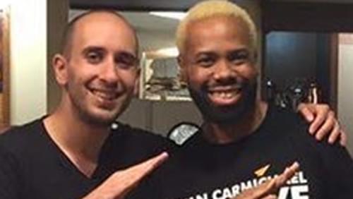
zan the man
Zan The Man went from DJing private celebrity and corporate events to becoming the first Built To Serve coach.
Angela Vasquez
Angela went from lacking confidence and feeling not good enough to hosting a daily live IG show and launching #Believe Raids.
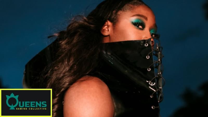
queen's GG
I'm a first round investor in Queens Gaming Collective, whose mission is to level the playing field for women in gaming.
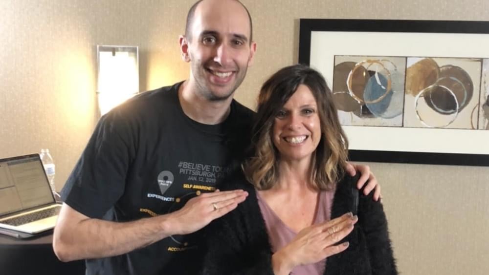
Kyle & Sarah
Kyle went from being homeless & sleeping outside Walmarts to being a full time streamer & running an eSports agency with fiancé Sarah.
drew hitchcock
Drew went from being let go from his job during COVID to building a six-figure YouTube consulting agency helping his heroes grow.
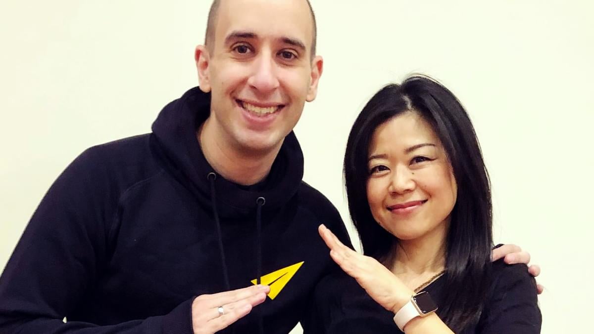
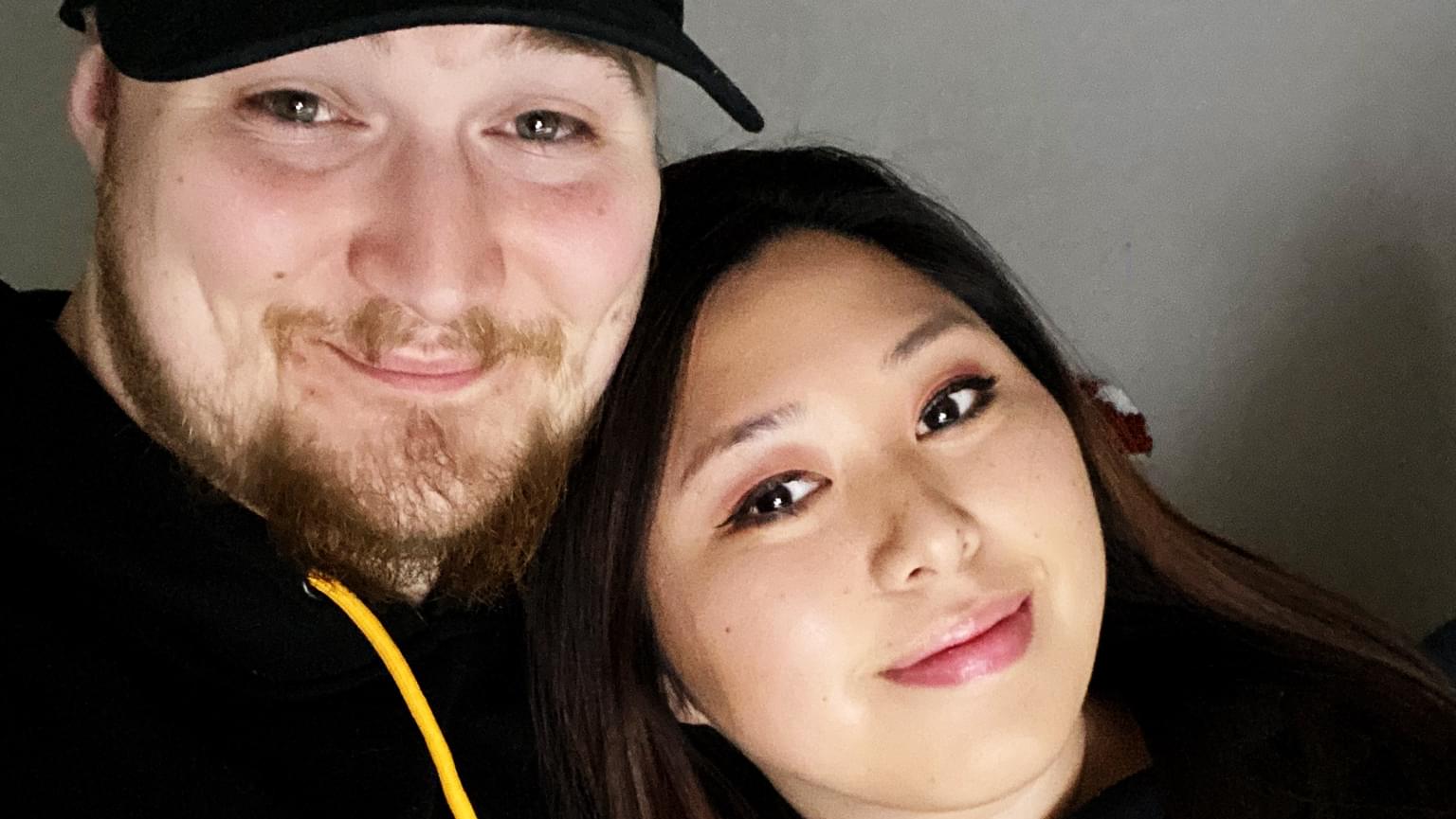
Yuko Shaw
Yuko went from being a shy introvert to helping women find their voice and running our Japanese YouTube channel.
Kiva Entrepreneurs
I've loaned money to over 7,000 entrepreneurs through Kiva. This is Victoria from Tanzania. Her business helps students find jobs.
Devon Triche
Devon went from a life of self-doubt to fully believing in his purpose and becoming Creative Director of our #BlackExcellence YouTube channel.
Bo Hawkins
Bo went from a dead end 9-5 career he hated to building a six-figure agency that books great guests for interview shows.
Gastón Alvarez
Gastón went from carrying and connecting sound equipment to running my Spanish YouTube channel with over 1M subscribers.
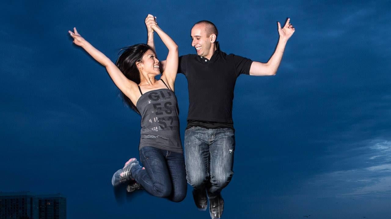
So here's my story...


Free Access to Evan's Success Playbook
Join over 100,000 subscribers! Get 3 new strategies every week to be more motivated, confident, & successful.